Dark Mode
Ionic makes it easy to change the palettes of your app, including supporting dark color schemes. Dark mode is a display setting that changes all of an app's views to a dark palette. It has system-wide support on iOS and Android, making it highly desirable for developers to add to their apps.
Enabling Dark Palette
There are three provided ways to enable the dark palette in an app: always, based on system settings, or by using a CSS class.
Always
The default palette provided with Ionic Framework is a light palette, consisting of a light background and dark text. However, the default palette can be changed to the dark palette by importing the following stylesheet in the appropriate files:
- Angular
- Javascript
- React
- Vue
@import '@ionic/angular/css/palettes/dark.always.css';
import '@ionic/core/css/palettes/dark.always.css';
import '@ionic/react/css/palettes/dark.always.css';
import '@ionic/vue/css/palettes/dark.always.css';
This sets the application colors and stepped colors on the :root selector.
The following example will always display the dark palette, regardless of the system settings for dark mode.
Avoid targeting the .ios or .md selectors to override the Ionic dark palette, as these classes are added to each component and will take priority over globally defined variables. Instead, we can target the mode-specific classes on the :root element.
System
The system approach to enable dark mode involves checking the system settings for the user's preferred color scheme. This is the default when starting a new Ionic Framework app. Importing the following stylesheet in the appropriate file will automatically retrieve the user's preference from the system settings and apply the dark palette when dark mode is preferred:
- Angular
- Javascript
- React
- Vue
@import '@ionic/angular/css/palettes/dark.system.css';
import '@ionic/core/css/palettes/dark.system.css';
import '@ionic/react/css/palettes/dark.system.css';
import '@ionic/vue/css/palettes/dark.system.css';
This sets the application colors and stepped colors when the CSS media query for prefers-color-scheme is dark. The prefers-color-scheme media query is supported by all modern browsers. If support for older browser is required, we recommend using the CSS class approach.
The following example uses the system settings to decide when to show dark mode.
Not sure how to change the system settings? Here's how to enable dark mode on Windows 11 and on macOS.
Avoid targeting the .ios or .md selectors to override the Ionic dark palette, as these classes are added to each component and will take priority over globally defined variables. Instead, we can target the mode-specific classes on the :root element.
CSS Class
While the previous approaches are excellent for enabling the dark palette through file imports alone, there are scenarios where you may need more control over its application. In cases where you need to apply the dark palette conditionally, such as through a toggle, or if you want to extend the functionality based on system settings, we provide a dark palette class file. This file applies the dark palette when a specific class is added to an app. Importing the following stylesheet into the appropriate file will provide the necessary styles for using the dark palette with the class:
- Angular
- Javascript
- React
- Vue
@import '@ionic/angular/css/palettes/dark.class.css';
import '@ionic/core/css/palettes/dark.class.css';
import '@ionic/react/css/palettes/dark.class.css';
import '@ionic/vue/css/palettes/dark.class.css';
This sets the application colors and stepped colors on the .ion-palette-dark selector, which must be applied to the app by the developer.
The following example combines site settings, system settings, and the toggle to decide when to show dark mode. The site's palette takes precedence over system settings. If your system settings differ from the site's palette when the demo loads, it will use the site's palette.
Not sure how to change the system settings? Here's how to enable dark mode on Windows 11 and on macOS.
The .ion-palette-dark class must be added to the html element in order to work with the imported dark palette.
Adjusting System UI Components
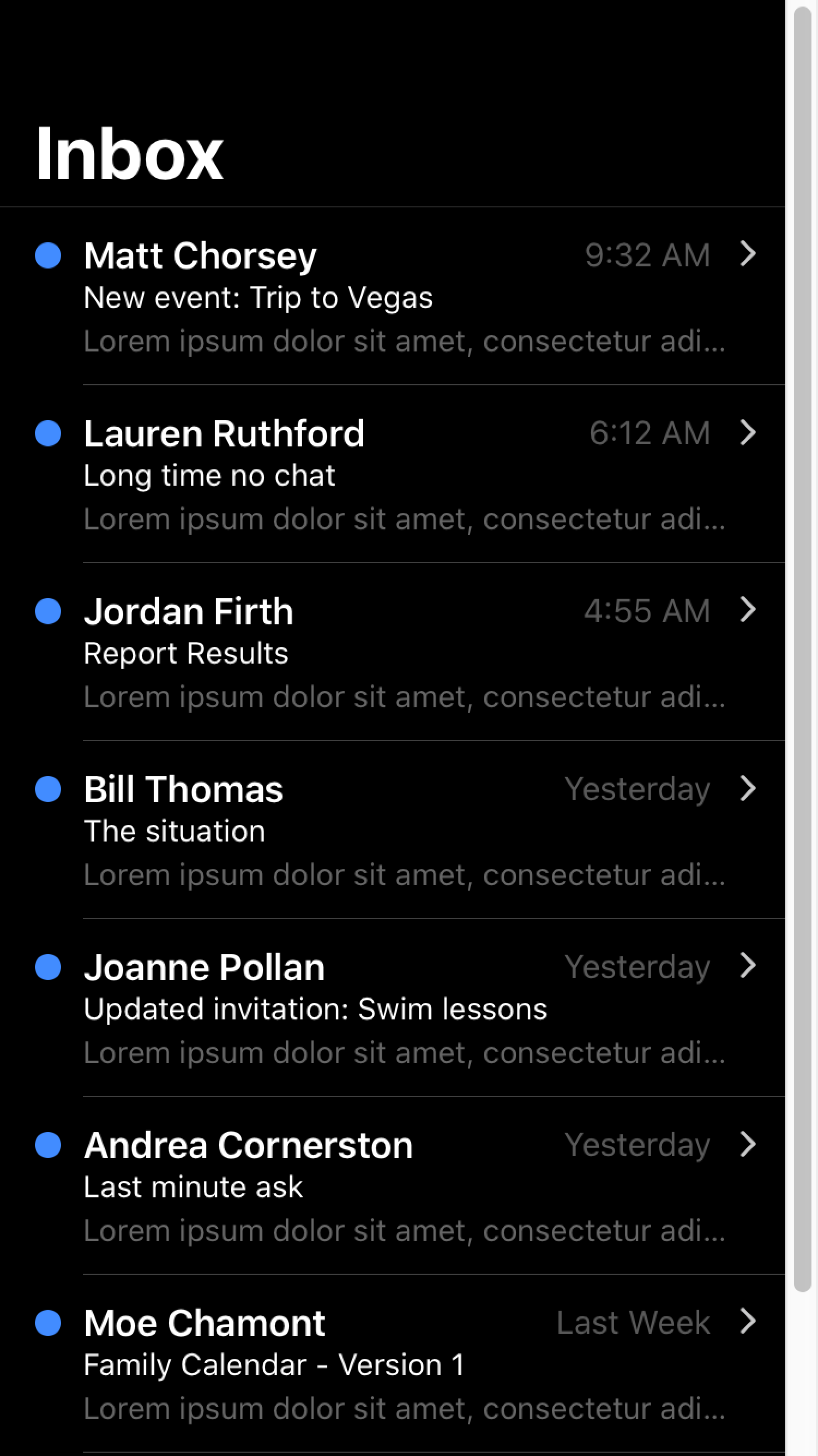
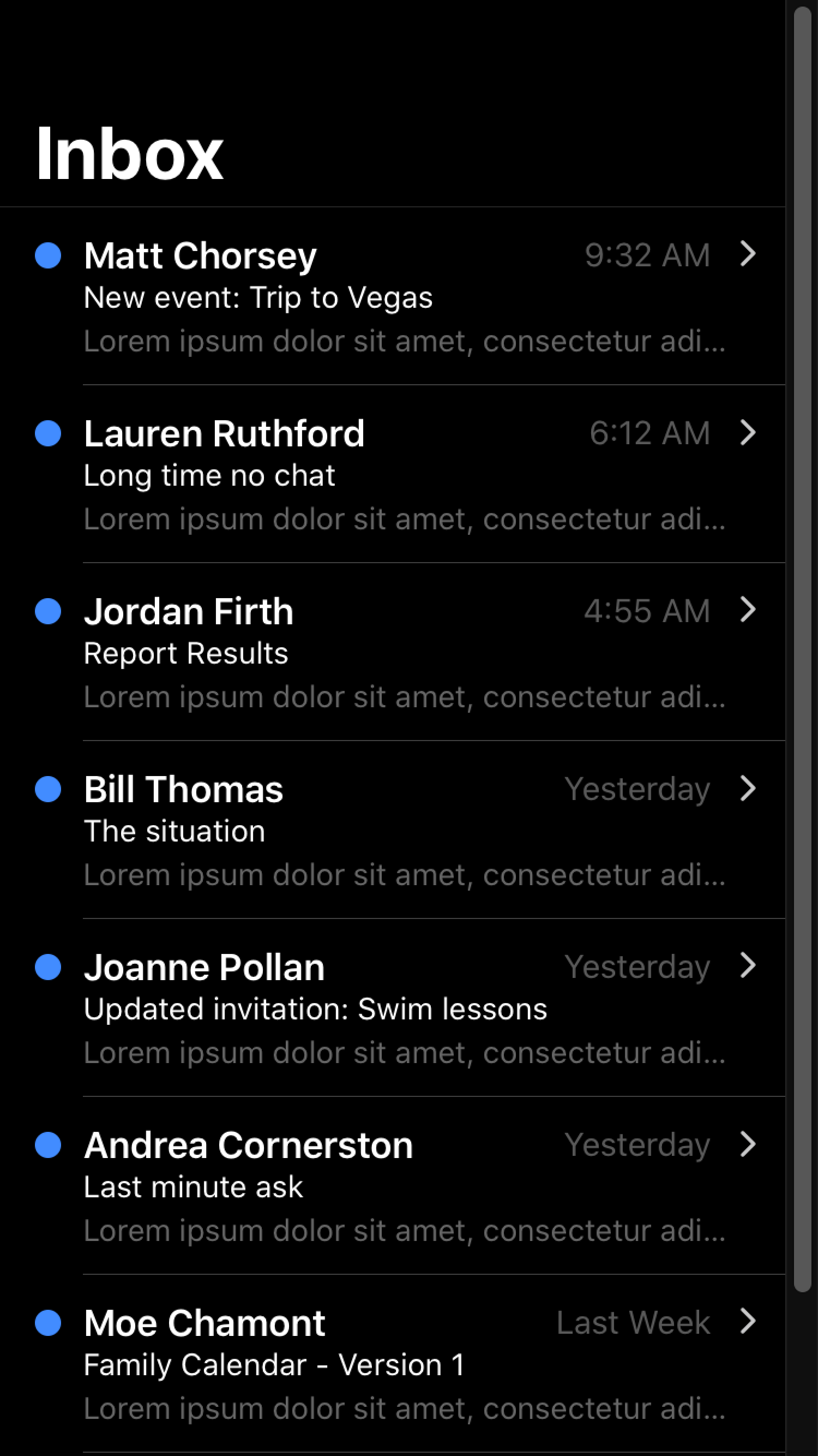
When developing a dark palette, you may notice that certain system UI components are not adjusting to dark mode properly. To fix this you will need to specify the color-scheme. See the browser compatibility for color-scheme for details on cross browser support.
While you may be mainly using Ionic components instead of only native components, color-scheme can also affect aspects of your application such as the scrollbar. In order to use color-scheme you will need to add the following HTML to the head of your application:
<meta name="color-scheme" content="light dark" />
This allows the page to indicate which color scheme it is comfortable being rendered with. Alternatively, you can add the following CSS to do this on a per-element basis:
color-scheme: light dark;
| Default scrollbar | Scrollbar with color-scheme |
|---|---|
 |  |
For more information regarding color-scheme, please see the Web.dev guide on color schemes.
color-scheme does not apply to the keyboard. For details on how dark mode works with the keyboard, see Keyboard Documentation.
For developers looking to customize the theme color under the status bar in Safari on iOS 15 or the toolbar in Safari on macOS, see theme-color Meta.
Ionic Dark Palette
Ionic has a recommended dark palette that can be enabled in three different ways: always, based on system settings, or by using a CSS class. Each of these methods involves importing the dark palette file with the corresponding name.
The contents of each file are included below for reference. These variables are set by importing the relevant dark palette file and do not need to be copied into an app. For more information on the variables being changed, including additional variables for further customization, refer to the Themes section.
- Always (dark.always.css)
- System (dark.system.css)
- Class (dark.class.css)
The always dark palette behaves in the following ways:
- Sets the Ionic colors for all modes to complement a dark palette in the
:rootselector. The:rootselector is identical to the selectorhtml, except that its specificity is higher. - Setting variables for the dark palette on
iosdevices using the:root.iosselector. - Setting variables for the dark palette on
mddevices using the:root.mdselector.
It is important to pay attention to the specificity if you want to override any of the Ionic dark palette variables. For example, because the --ion-item-background variable is set for each mode, it cannot be overridden in the :root selector. A higher specificity selector, such as :root.ios, is required.
The contents of Ionic's dark palette can be viewed on GitHub. The CSS used to apply the always dark palette can be found in the repository.
The system dark palette behaves in the following ways:
- Sets the Ionic colors for all modes to complement a dark palette in the
:rootselector. The:rootselector is identical to the selectorhtml, except that its specificity is higher. - Setting variables for the dark palette on
iosdevices using the:root.iosselector. - Setting variables for the dark palette on
mddevices using the:root.mdselector. - Only applies these variables when the CSS media query for
prefers-color-schemeisdark.
It is important to pay attention to the specificity if you want to override any of the Ionic dark palette variables. For example, because the --ion-item-background variable is set for each mode, it cannot be overridden in the :root selector. A higher specificity selector, such as :root.ios, is required.
The contents of Ionic's dark palette can be viewed on GitHub. The CSS used to apply the system dark palette can be found in the repository.
The class dark palette behaves in the following ways:
- Sets the Ionic colors for all modes to complement a dark palette in the
.ion-palette-darkselector. The.ion-palette-darkclass must be added to thehtmlelement in an app. - Setting variables for the dark palette on
iosdevices using the.ion-palette-dark.iosselector. - Setting variables for the dark palette on
mddevices using the.ion-palette-dark.mdselector.
It is important to pay attention to the specificity if you want to override any of the Ionic dark palette variables. For example, because the --ion-item-background variable is set for each mode, it cannot be overridden in the .ion-palette-dark selector. A higher specificity selector, such as .ion-palette-dark.ios, is required.
The contents of Ionic's dark palette can be viewed on GitHub. The CSS used to apply the class dark palette can be found in the repository.